Oilfinger Garagenkultur
"Becoming a brand"
Since I started the idea of the Magazine "Oilfinger" I was sure, that I will try to make the whole project bigger then being only a magazine. Because I was sure there is so much potential in the whole idea of the Garagenkultur (=garage culture) then I squeezed out till today.
Being your own client does have a lot of positive and negative affects in the process. You are faced with the dilemma that you have to kill some of your darlings while also being happy to kill some baggage you dragged along.
When I started the magazine it was my Bachelor Thesis – Today I can present you my Master Thesis which was titled Oilfinger – Vom Magazin zur Marke (= Becoming a Brand)

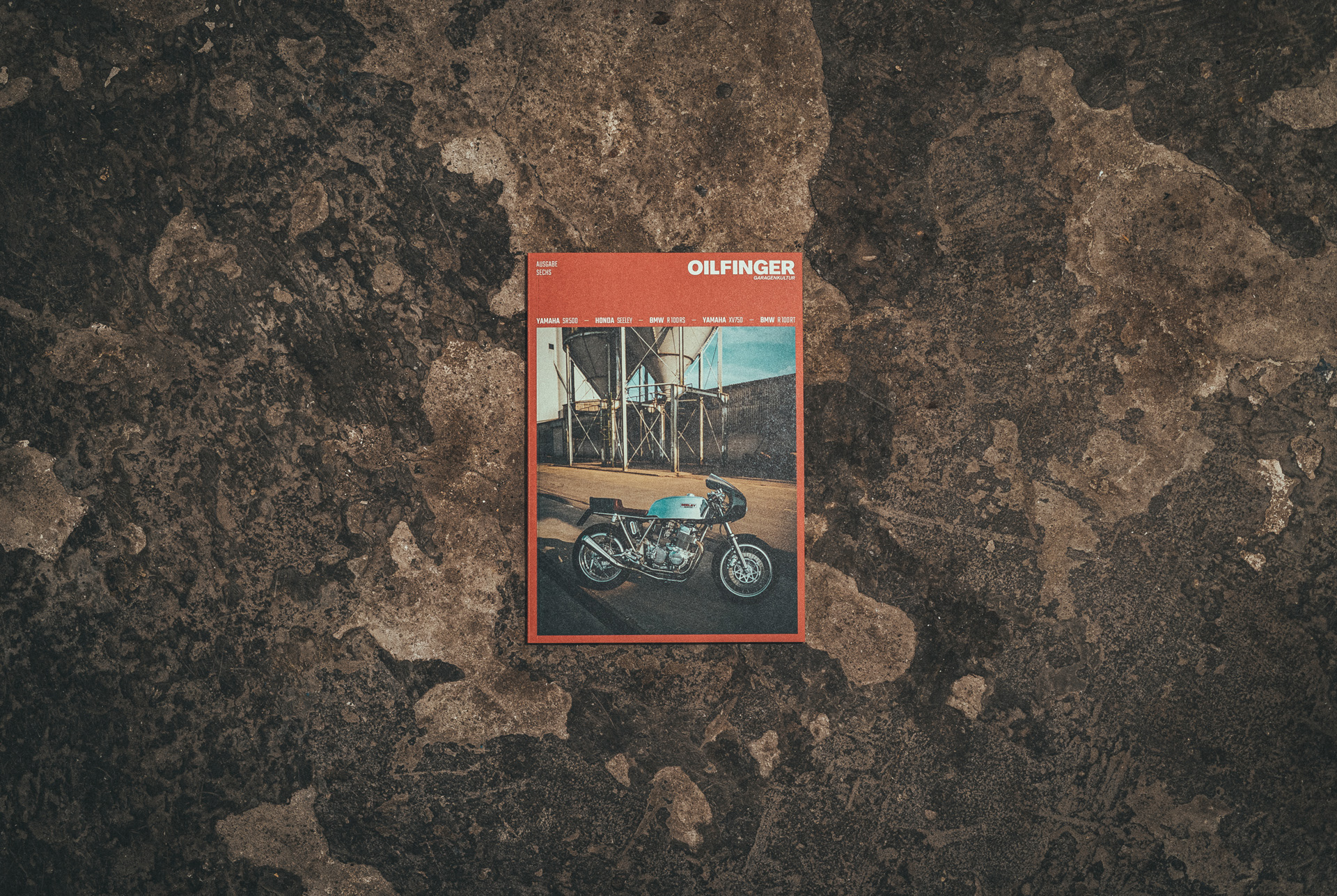
Side by side you can see a lot of changes in the picture above. The whole cover was redesigned in order to incorporate Ideas which follow in the inside of the Magazine. The Logo has changed visually and conceptually – because we went from being a Schraubermagazin to a Garagenkultur (Magazin). Wrenchmonkey -> Garage culture.

Using a logo with fine details like those scratch marks is no possible in every size and the claim "schraubermagazin" was not incorporated into the idea at all. The Idea was to go simple and not try to be the loudest brand in the world of custom bike magazines. We are not competing at the store since we only sell the magazine in our online store and some stores. We wanted to be a stage for the talented people building bikes – we put our content first, because that's what our customers are here for. We are not Nike or Adidas, there are no fanboys that just go nuts for every piece we put out there. So we evaluated the content we presented higher then having a super catchy logo. Simple, clean,usable. Just as a custom bike should be built.
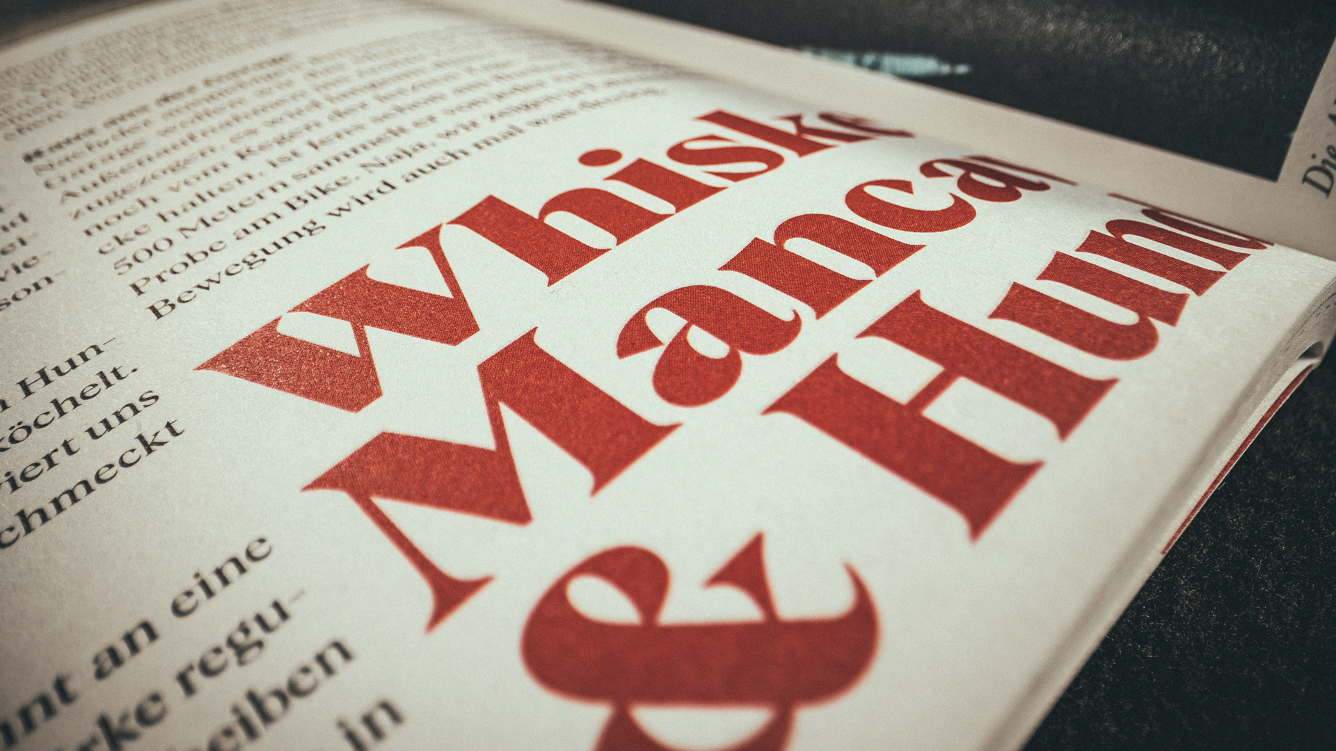

With the typography the idea was to be more bold – not necessarily focused on the font weight but more on the font itself. Oilfinger started with a combination of the Teko and Baskerville but evolved with the rebranding by using the Albra as the main font. Which I still love and found here on behance! Albra !
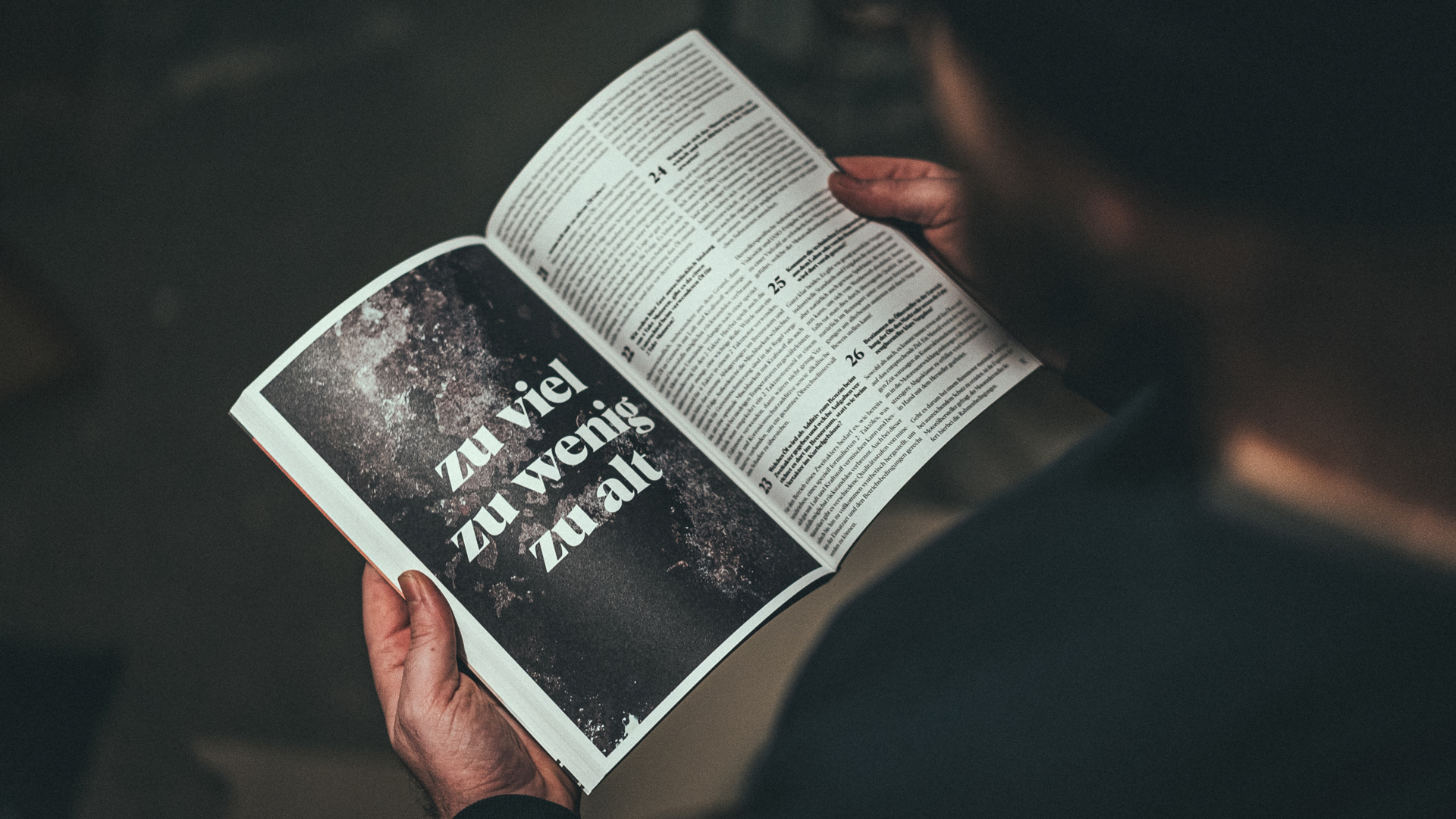
Another aspect was to go bold on using as much space as possible – since using a lot of white space is still "on vogue" I wanted to go the exact opposite way. The idea comes from the bikes which are presented inside of the magazine. Most of the are made to be simple and not just use stuff you do not really need. Because you do not really need the white space it had to go!
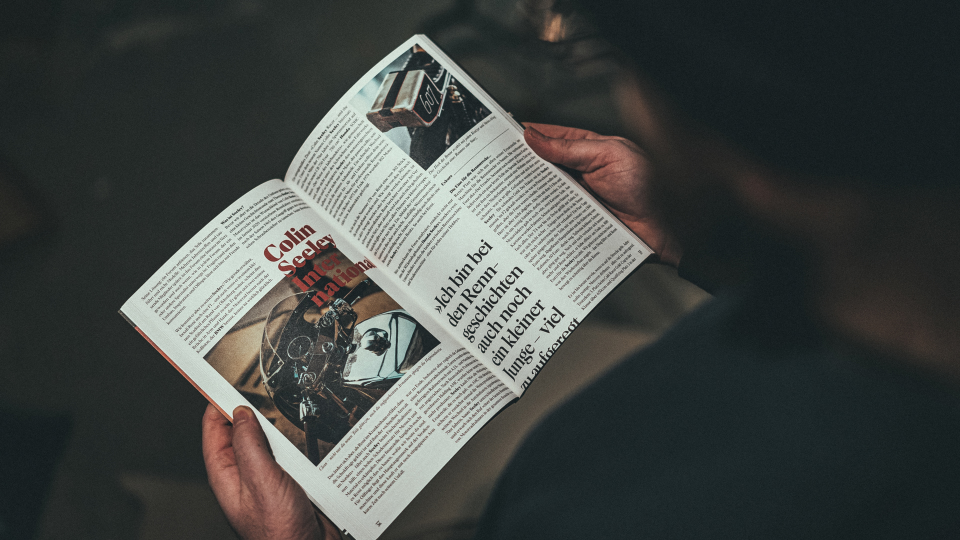
Some of my favorite side above and below: clean technical details and a minimal usage of whitespace.
Website
Since I started the website was curse and cure at the same time – I was gifted the time of a trainee from a friend of a friend. But since it was a trainee, I could not really count on a perfect representation of my Ideas. I don't want to sound arrogant I am truly thankful for the opportunity but I was more then happy to pay a friend of mine to redo everything just as I wanted it. Here are some screens, but please visit our website to enjoy the content interactive.
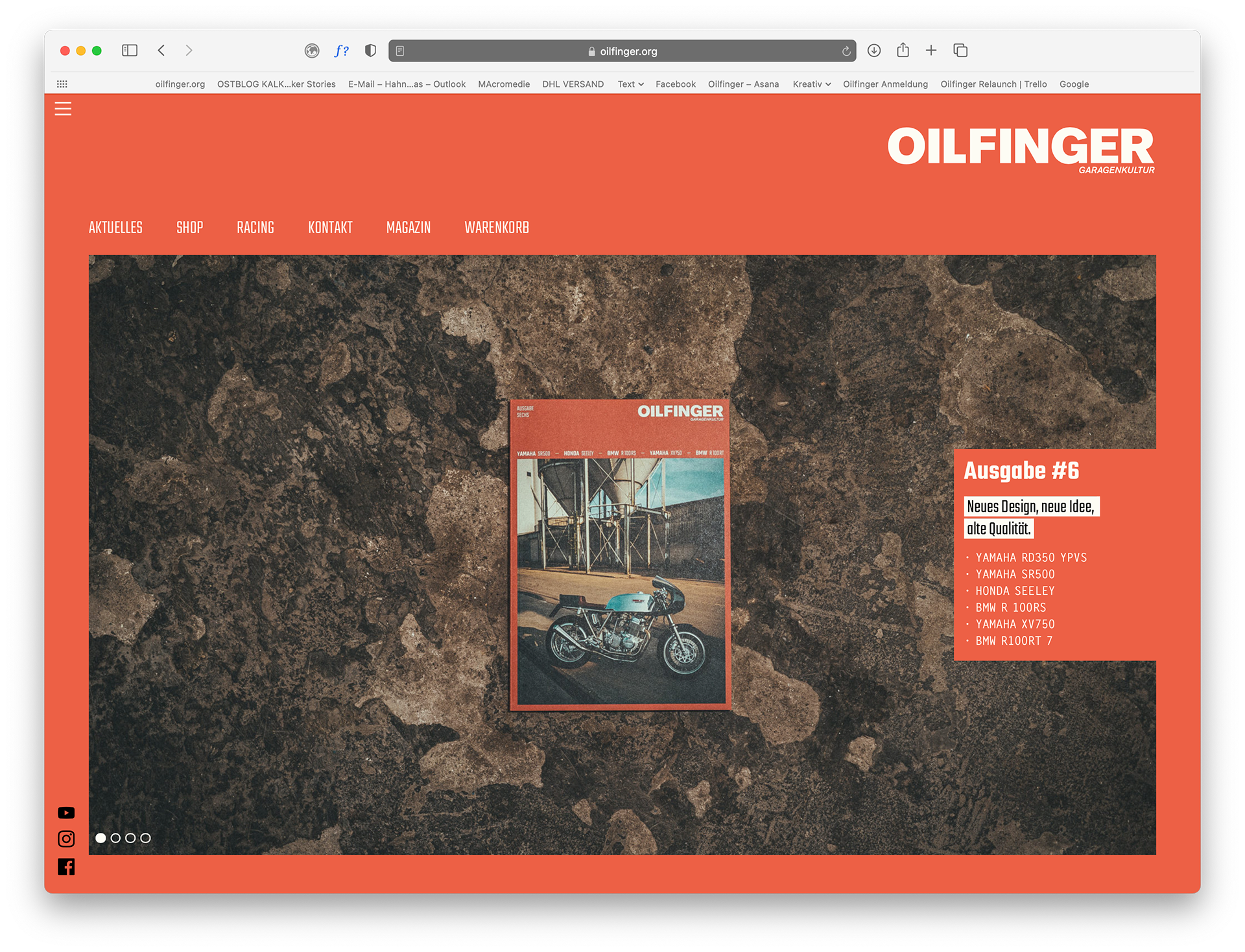
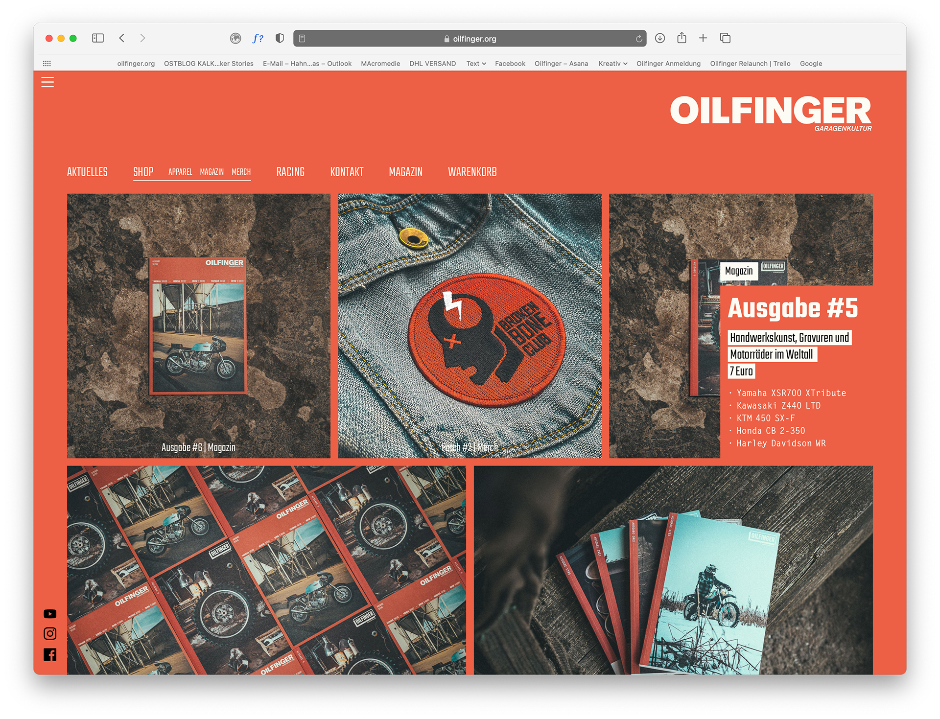
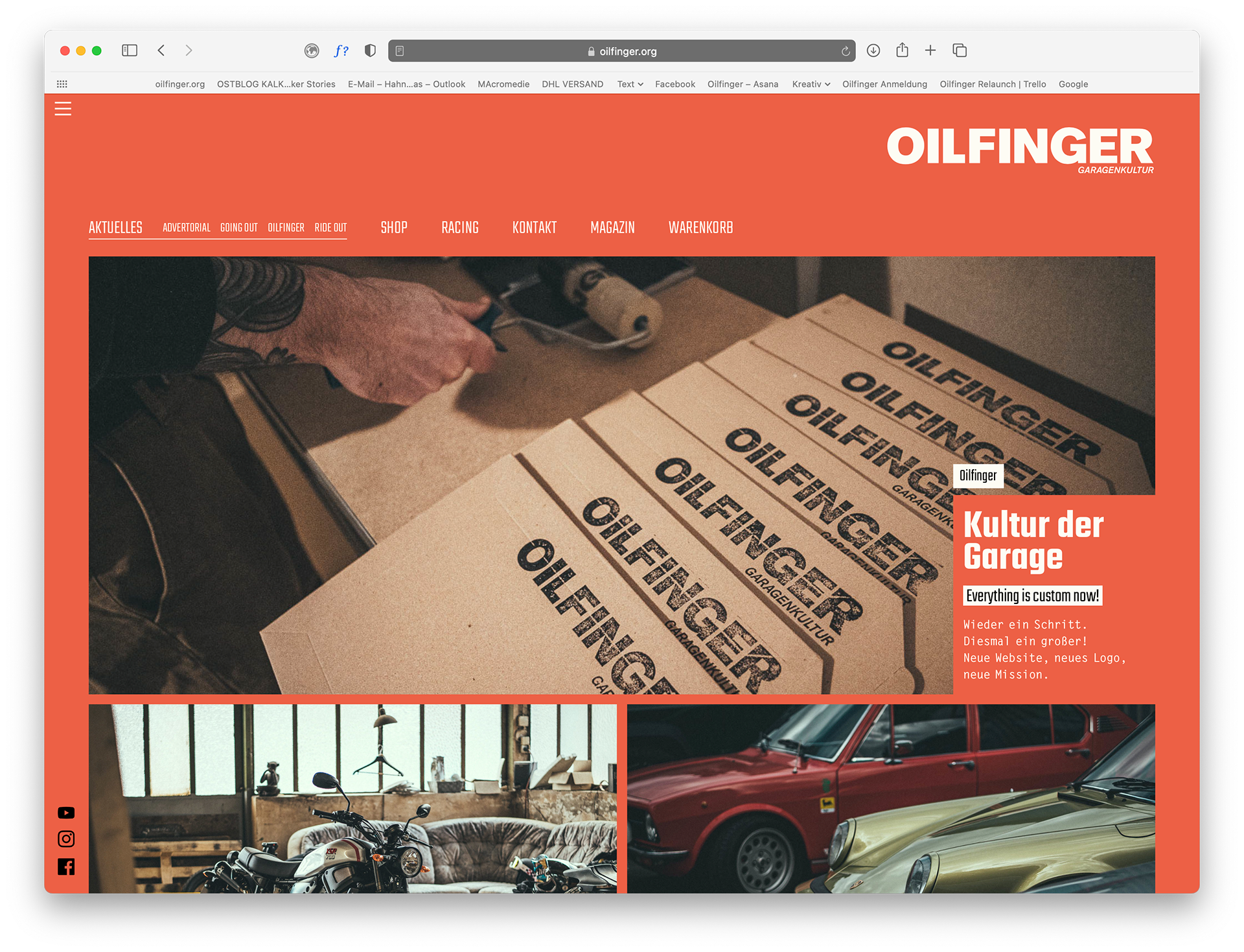
The Idea was to have a visual connection between the Magazin and the website – Using red is no easy on the eyes but we picked a hue which is perfectly fine for light reading. For a longer paragraph we change it to white. As you can see on the Website.
Firefox still does something funny with the color – so maybe look at it with another browser.
Being able to incorporate new media into our website we created some short clips to get your mouth watery while browsing our content. Down below is one which concentrated on the Magazin. Another one you can find on our Youtube Channel
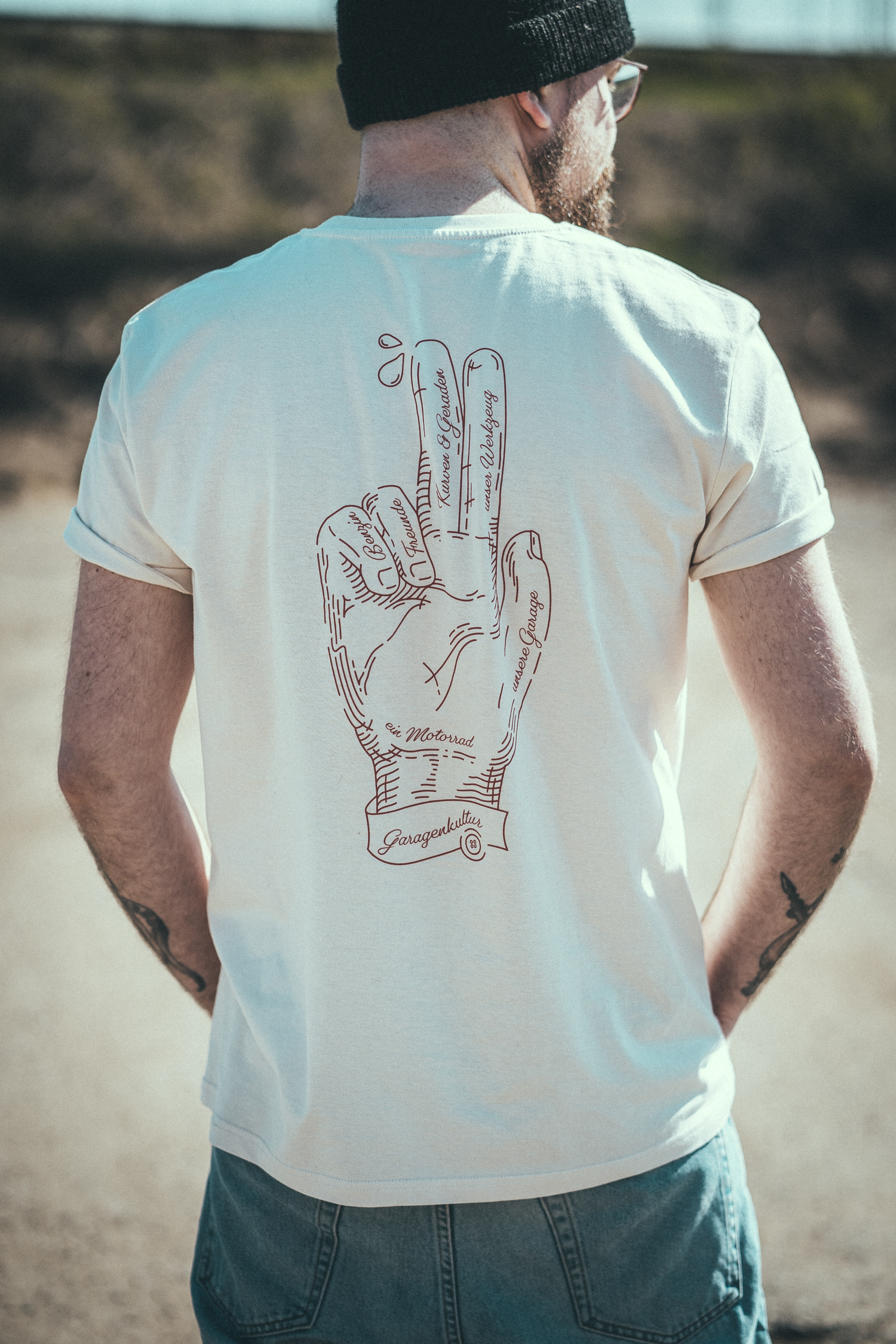
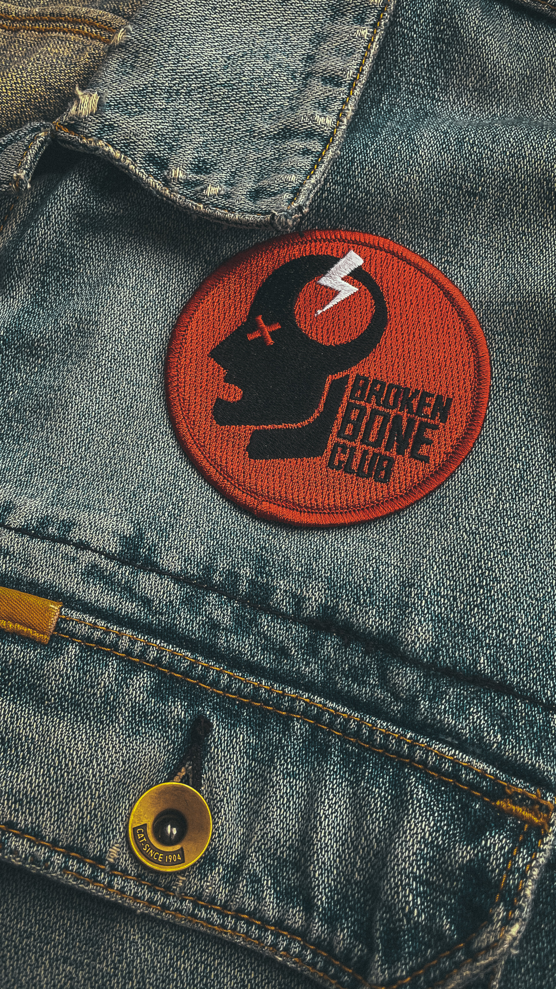
With new Website and Ideas came new ideas creating merchandise and other stuff. Since a brand is never finished it just grows I will not call this one finished – if you want to see more just visit our website or check our social media.